

Vi Novell
Date: Noviembre 2023
Client: Celler Masroig
Celler Masroig is a wine cellar that has been producing wine for more than a hundred years. It is located in Vall Do Montsant, a valley from Catalonia.
In 2023, the celler decided to include their youngest wine, the Vi Novell, in the catalog in order to honour an ancient tradition: the celebration of the first harvest of the year. For this purpose, they made a call for creatives and wine enthusiasts to create a label that defines their fresher product, which represent closely the idiosyncrasies of this region with a modest personality.
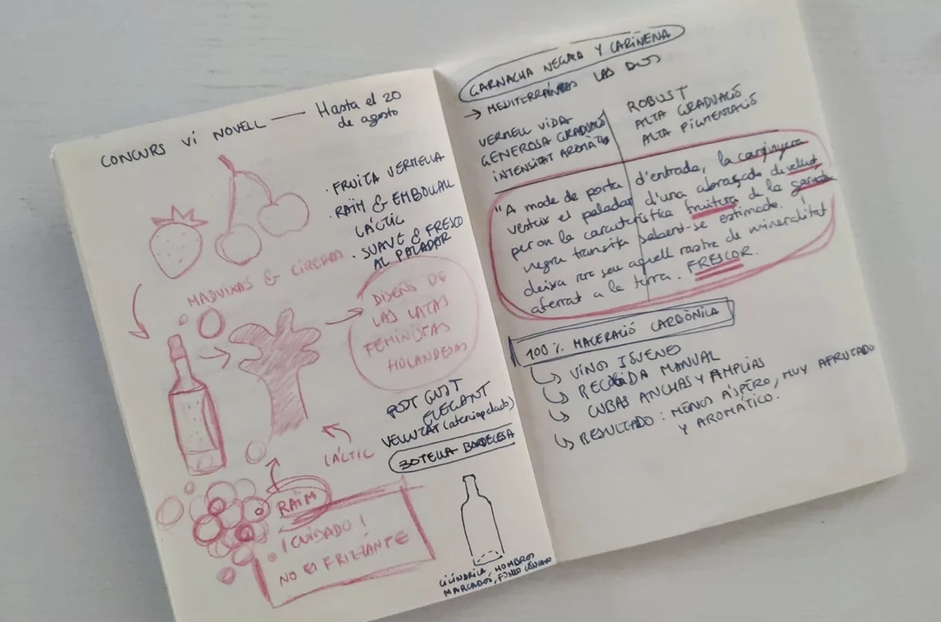
First sketches of the project. A little investigation about all the things that involve the Vi Novell: what kind of grapes are used to make this wine, how is the geography of the place, the steps of its elaboration and its personality.
Concept: the significance of the land
In the land is where everything starts. Is the place where all of us belong to. Our land embrace us, it is in our DNA. Even though when we are far away from our land, we never leave our customs nor our people. The land is a mother too, is the matter where the grapevine can grow, and give it its character.
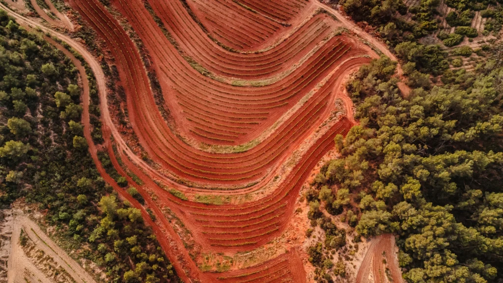
In the narrative of this project I use the land as a guiding theme because of its peculiarities. Here we can see the Montsant Natural Park, where is placed El Masroig. It is known for its red ground and the farming in different levels because of the mountains, which gives natural balconies to the landscape.
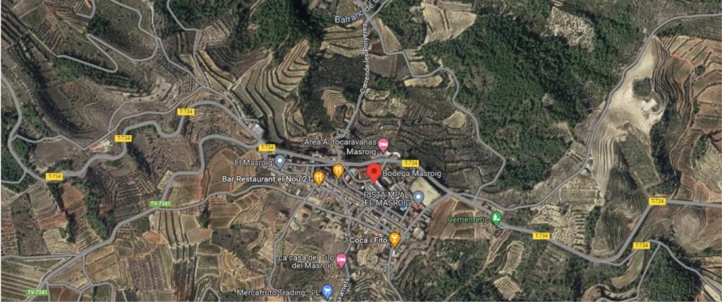


Satellite view of El Masroig | Screenshot from Google Maps
Pictures of the landscape from Celler Masroig website
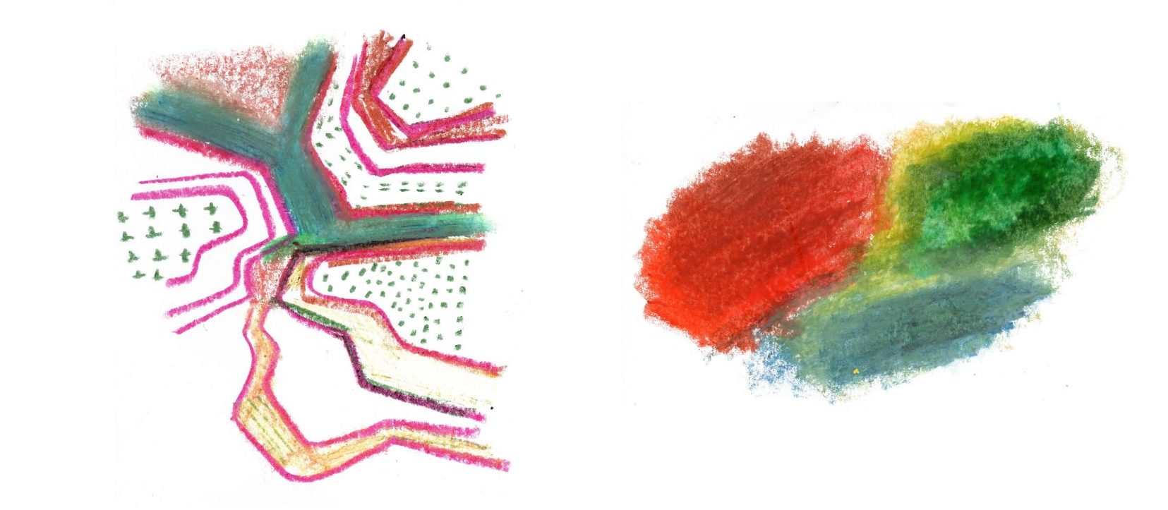
I made some illustrations representing these characteristics in a simple way, using oil pastels and vivid colors.
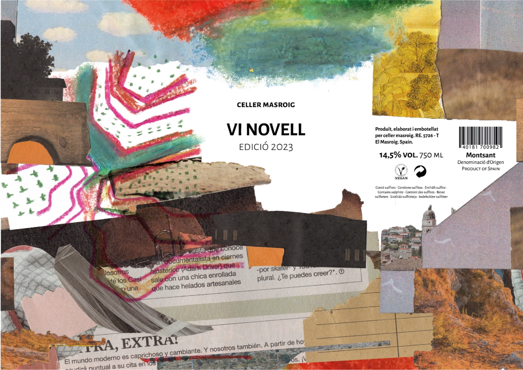
Final composition: mixed media
Combining a collage landscape that represents The Montsant Natural Park with the textures and colors of the previous illustrations leaving some spaces for the information of the label.
The typeface
I use the Alegreya Sans in this project. In words of Juan Pablo del Peral, the creator of this typeface «Alegreya is a humanist sans serif family with a calligraphic feeling».
The Alegreya Sans has been carefully designed, with a wide range of variations, including italic and small caps in all of them, so this font make so easy the correct layout of the mandatory information into the label.

In spite of it is a sans serif, you can see these little variations at the end of the strokes, a characteristic that gives to this font an extrovert and warm personality, at the same time it feels elegant and clean.


