Mode
Date: February 2022
Client: Mode, a freelance pattern maker
Mode is a pattern making, fashion design and sewing professional. She has worked both as a freelancer and for different companies during her whole life, but lately she found out that she prefers teaching fashion instead of making fashion.
When we first met, she had tons of notes and documents which envolved all her professional development and knowledge. In order to make it understandable, we started by putting the principal pieces in place: How does she defines herself as a professional? How can we adapt this information to beginners? Which kind of content does she wants to offer?
Go to
The first thing we were thinking about was the name, since Mode did not have a professional identity to introduce herself with, but we already had it. Mode is similar to the word for fashion in Spanish —Moda— and in French too —Mode—. Mode is short and easy to pronounce.
Brainstorming: if she were.
«If she were» is a creative technique which consist in assign different categories to the brand, and we try to imagine which element from each category could describe accurately its personality.
If Mode were a book, it could be a paper doll book;
If Mode were a color, it could be a light purple;
If Mode were a season, it could be spring or autumn, it is changes and movement;
If Mode were a place, it could be a small Andalusian village, in the middle of nature.
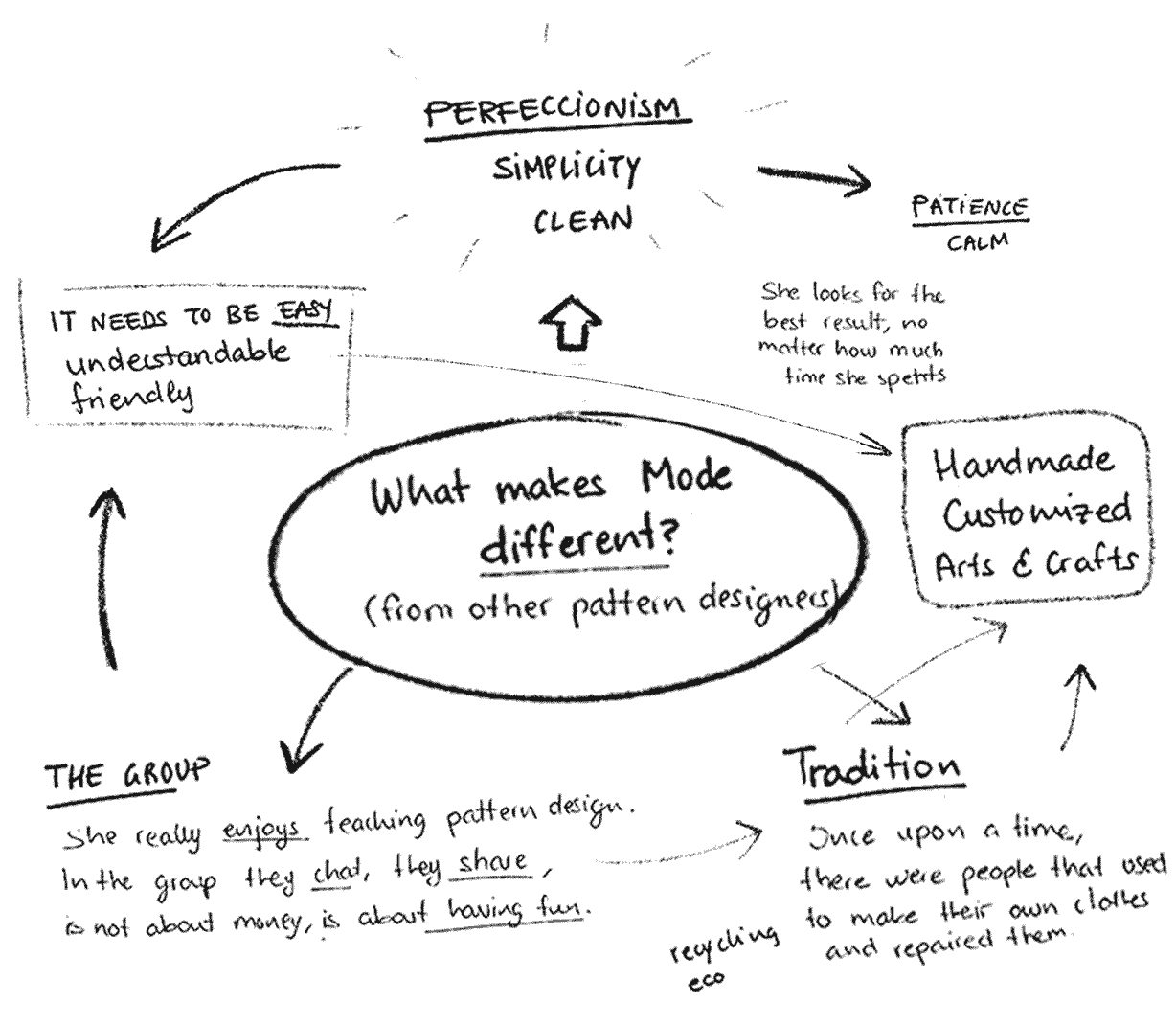
Then, we try to put in place this abstract ideas using a mind map, linking the main concepts, so the conclusion is that Mode is defined by tradition, handcraft, natural, practical and measured.
Main concept: in it’s proper measure.
It express elegance, calm, patience, simplicity, satisfaction and perfectionism among other things.
This is an expression that Mode usually use, but also is a perfect description for a profession that traditionally has been defined by an exigent and accurate manual process, but too organic too.
Mode is clean, plain and natural.
A handwritten typography, light, simple and organic, with a wide tracking. It offers a calm and kind, but firm personality.
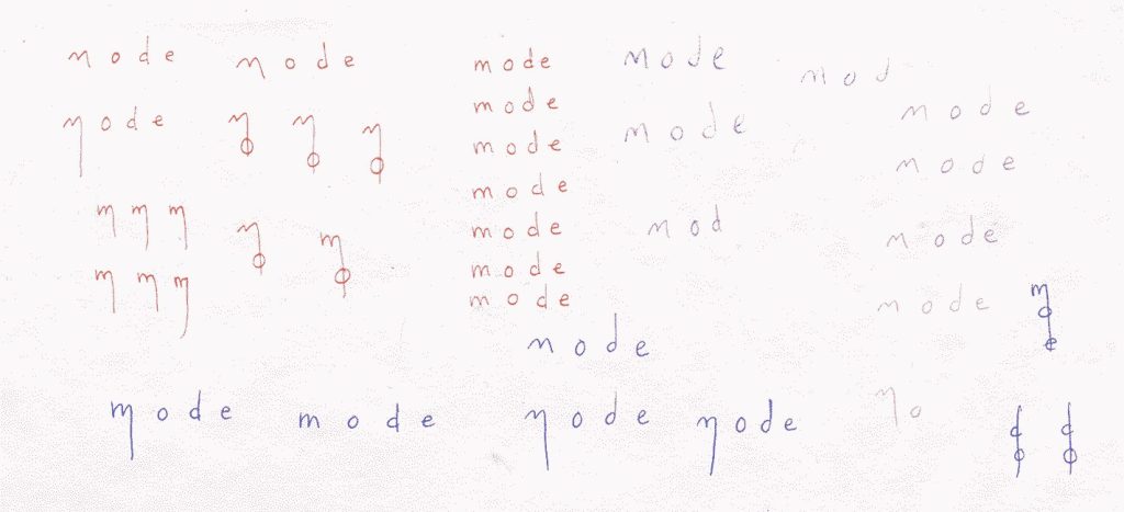
Some handwritten tests for the Mode logo
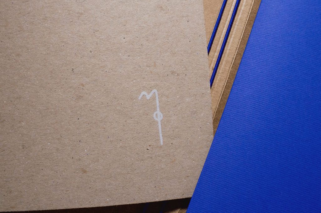
From the combination of the letter M and O, while extending one of the M strokes, it results a symbol that shows a kind of needle sewing a stitch. It works as a monograph too.
The textbook.
This step starts with tones of information that Mode has been writing down during her professional career. They are copies and notes that need to be put in order and translated, just to be more attractive and comprehensive to the public, so they can reach more comfortably to the students.
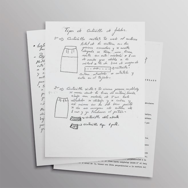
Mode’s notes by hand and some copies.
Mode needs a script, some guidelines that complement her classes, so the aim is to design a brand new manual for her.
The structure.
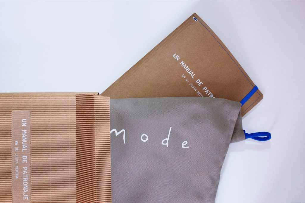
The structure of the manual is customizable. At the outside, there is a strong cardboard cover, which works as a folder too, so it has a pocket where you can save your notes and documents. This folder has a pair of rubber bands in the inside, where the content can be fasten: the manual is made up of separate booklets which talks about different lessons. This way, you can purchase only the content you are interested in, and create the manual that works better for you, with the possibility of attaching your own notes and projects too.
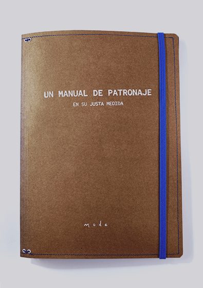

Pictures of the cover of Mode’s students manual.
The layout: composition, typefaces and colors.
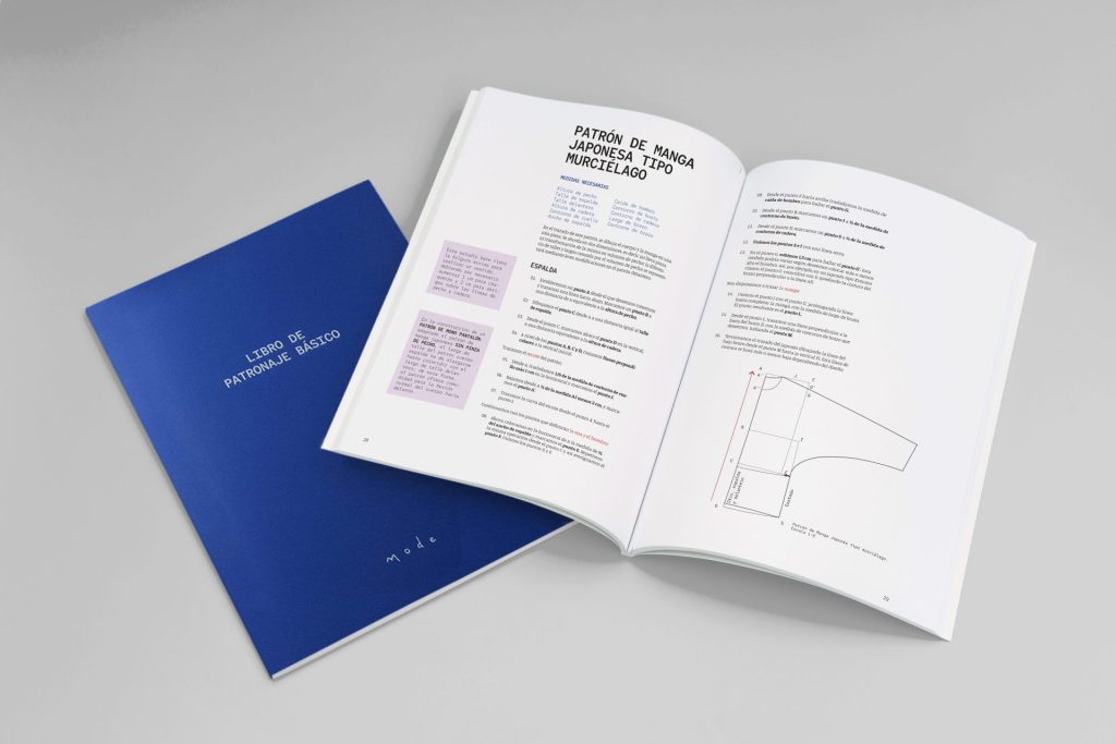
Pattern designing is essentially a practical discipline, so the way the textbook explain the process is so similar to the user manual of an Ikea shelf. This means that it needs diagrams in every page that could show the step by step.
That is why I chose a two columns structure, where is easy to distinguish the picture and the key notes at the margin side, from the principal information at the center.
Besides this structure, there are other strategies to help in the readability of the manual. The use of completely different typefaces for titles and body text is one of them.
Red Hat Mono for the titles and the annotations.
It reminds to the old documents made by a typewriter, so similar to the original Mode’s notes. It is used for the practical information: titles, important key notes and tips from the main text, subtitles and the annotations of the diagrams.
Manuale Regular for the body text.
In words of its creators, Pablo Cosgaya and Eduardo Tunni, «Manuale is a type family that […] is halfway on an old roman typeface and a contemporary one, which have a straightforward appearance. […] This is a versatile type family perfectly fit for long texts».
I chose this one because is clean and easy to read; it gives a contemporary look to the textbook, while having all the readability advantages of a good designed roman.
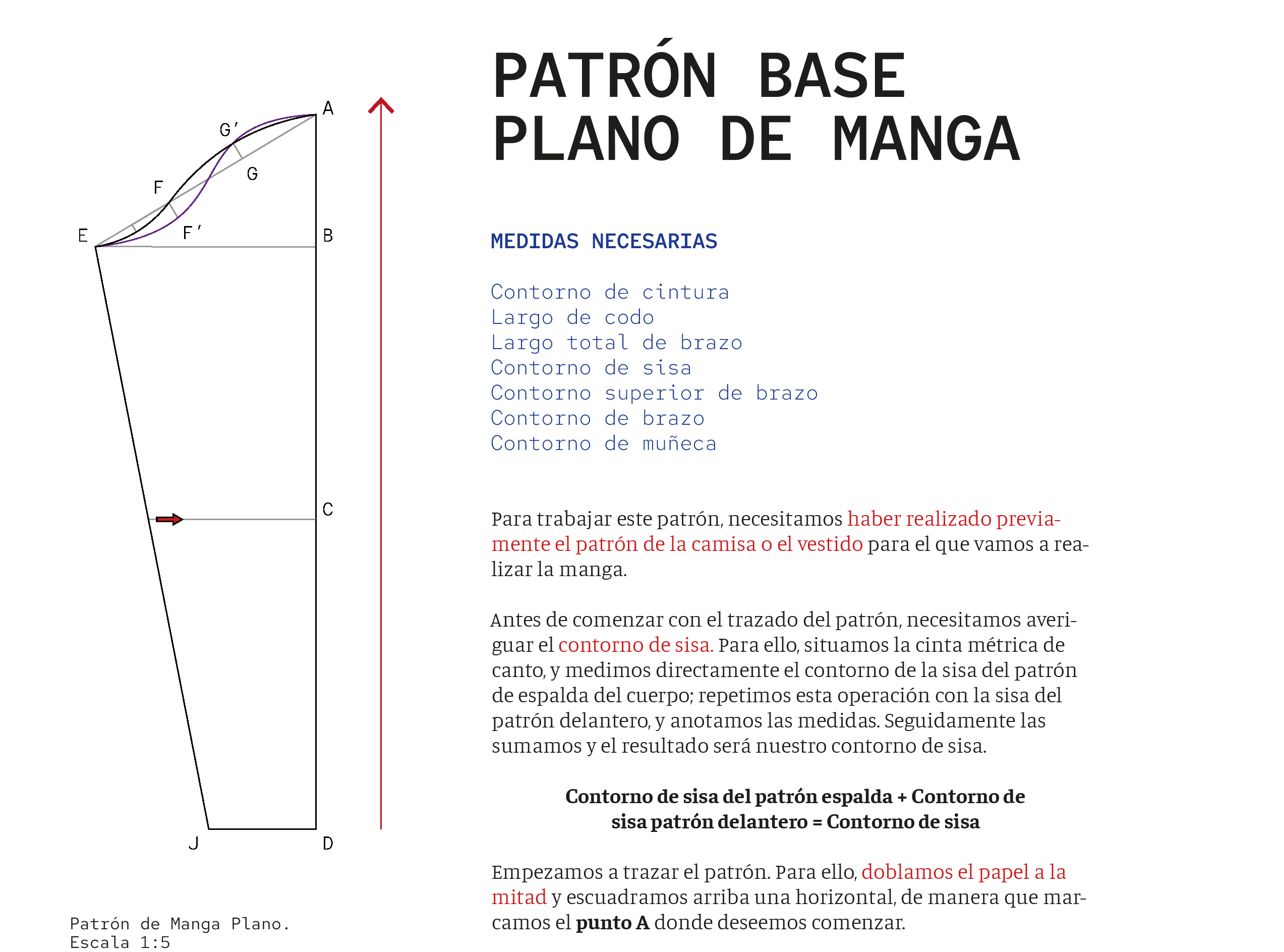
Original layout example from the textbook.
There is a color code too, that makes easier for the user to understand in a blink the kind of information that is reading.
Along the manual, there is a color combination that is always used for the same purpose. The main brand colors are red and blue, the same as the bicolor pencil that pattern designers use on their works to make the different marks. Combining both of them, the result is a purple that works as a secondary brand color.
Blue is for the introduction list at every lesson that says what kind of measures we are going to need to develop that pattern. It is used as a principal color in the packaging, since the details and the principal manual cover are blue too. Red is used to outline important information during the explanation of every lesson, and is the color of the arrows in the diagrams. The purple, lighter and neutral, are related with the calm personality of Mode, and it is a great connection for all the textbook information. It always shows secondary information, interesting tips and notes that is important to remember. Is the color for the complementary notebook that the students can use to write down different measures.
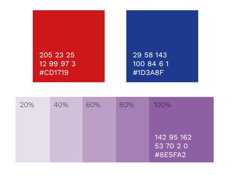
Blue and red are the main colors. They are used at the packaging and for important information during the text.
Purple is the combination of both, and it works as a connection all over the manual. It is used for notes and tips at every lesson.